Monday 29 November 2010

Digital Manipulation: Filters

OK, we're getting there people! I've almost caught up with Marie's list.

For this section of the digital manipulation part of the course, we were asked to to use photoshop filters to modify two pictures. We would have to use the rectangular marquee tool to separate each picture in to six sections, and we would then apply a different filter to each section. After opening the images in photoshop, I went to the filters menu and selected which filters I wanted to use:

 
As you can see, for the first picture I decided to use some of the artistic filters. In the end I settled on the following: 

Film Grain, Poster Edges, Coloured Pencil
 Rough pastels, Plastic Wrap, Water Colour

For the second picture I decided to use four of the texture filters, and two more artistic filters.  At this point I'd love to show you another screen grab, but my laptop's decided to refuse to let me capture anymore (poor baby, I think I've been working her too hard over the last few weeks!)

Craquelure, Mosaic Tiles, Patchwork, Stained Glass
Palette Knife, Sponge.

I tried to make the squares as neat as possible by going to view-rulers, but something clearly went wrong with the fifth square.

Well, there you have it, a crash course in the use of photoshop filters. You've probably noticed some of them are more obvious than others, but they all give you an interesting effect to use on your photo's.

Digital Manipulation: Initial Ideas

I've been thinking about what to do for the digital manipulation section of the course for a while and as usual I've had loads of ideas, all of which are far too complicated to be done within the time frame available. I have had a few ideas that I think are sufficiently interesting, both for me and the expectations people seem to have of me. As a bonus they're possibly even achievable!

  1. Breaking out of the frame.
  2. David Hockney style Photo Montage.
  3. Photo collage.
  4. Smoke pictures.
  5. Skin Textures.
  6. General jiggery pokery.
Breaking Out Of The Frame

I'm sure you've all seen his sort of picture. It basically entails taking something like a photo frame, or book, and photoshopping a photograph so that it looks like it's actually coming out of the object. e.g a waterfall cascading out of a picture and down the wall of the house. I like this idea, but the main stumbling block I foresee, is actually getting the necessary pictures within the next couple of weeks. I've got a few thoughts about shots that might be feasible, but I'll have to talk to Marie.

David Hockney Photo Montage

If you've read my Hockney research post (and I can't see why you won't have), you'll know exactly what I mean by this. Rather than take a week to go out and shoot a scene from various angles and at all times of the day though, I'll just use photoshop to cut up the picture and then modify the frames, so they look as if they have been taken at different times. This is probably the easiest of the options (so naturally I'm shying away from it a little), but I'm not sure quite how good it will look in the end.

Photo Montage/Collage

Again, this is a relatively simple option, and will simply entail cutting and pasting various elements of different photographs, to create a new image.

Smoke Pictures

I haven't really fleshed this one out properly yet, but I've seen some great pictures where people have taken photographs of smoke, inverted the image and then added various colours. I've sort of got one idea for this theme, but I'm not sure I could stretch it to four photographs, and have them still remain sufficiently cohesive.

Skin Textures

If you take a look at the post before this about using layers, you'll see the sort of thing I'm talking about. Taking a photograph of someone, and then overlaying another photograph, or photographs, to create a new texture and pattern on their skin. Obviously, my previous attempt was a bit rushed, so I'll have to make sure the quality is a lot higher for any images I do produce (as these one's will actually be marked!) Like the breaking out of the frame idea. the only problem I can see is actually getting the necessary photographs in time.

General Jiggery Pokery

This theme would be very similar to the photos Marie showed us in class (the two halves of the apple sewn together, that sort of thing.) I'd use everyday objects and then add a digitally manipulated twist. Again I've got a couple of roughly thought out ideas, but would need to check if they're achievable in the time frame available. I'd also need to check if "everyday objects" is a good enough theme.

I appreciate none of these ideas are very detailed at the moment, but I just thought I'd get them out there for people to see. Once I've settled on a couple I'll do a more detailed post.

Sunday 28 November 2010

Digital Manipulation: Layers

I know we're supposed to use our own photo's for these tasks, but I couldn't find any that were particularly interesting for demonstrating the use of layers. I assume we aren't supposed to use other peoples photo's because of the copyright issues, so I've decided to sidestep that problem, by buying a couple from a stock website I have an account with: http://www.istockphoto.com Because this is just a bit of fun, I've gone for some cheaper, smaller images than I would normally, so the quality of the final picture isn't great (sorry!)


I'm going to try and combine the two, to simulate some photographs I've seen on Rankin's website: http://rankin.co.uk/beauty/#/pic84 He probably has a much more complicated system for producing his images, but I'm just trying to illustrate what you can do with layers (not produce fine art!)

You'll notice from the screenshots, that I''ve already produced the picture and I'm working my way backwards. I thought that would be the easiest way. I'm also trying to minimise the number of screen shots, to keep the post length down. OK, lets start.

Open the image of the girl in photoshop:


Then open the image of the flower.


Copy and paste the flower picture on to the first picture, this will automatically create a new layer which you can manipulate. Click the show transform tools check box, then rotate the picture 90 degrees and increase the scale, so that it covers the whole girl. Now go to the blending mode selection drop box and switch the blending mode to overlay:


This gives you a very basic picture, with the flower texture overlayed on the top, not bad, but it can still be improved. Go to layer-layer mask-reveal all. In the layers window, you'll now have a small white box next to the picture of the flower. Select a paintbrush (making sure it's set to black), open the paintbrush sub menu at the top of the screen and reduce the hardness down quite low (this means the brush won't create such harsh edges when you paint.) Making sure the layer mask box is selected use the brush to cover any areas you want to show through the texture layer, such as the eyes and teeth.


Again the picture doesn't look too bad, but I wanted a more dramatic effect. So dragging the flower layer down to the create new layer button twice, I created two copies of the layer (it automatically copies any layer masks and blending modes.) As both of the new layers, were also set to overlay, this creates a more dynamic picture. Unfortunately, it was a little too dynamic and I'd lost some of the detail, so, for the top most layer, I adjusted the master opacity down to 80%.


Finally I flattened the image, and here you have it:


I think it turned out quite well in the end, but then again I'm using much better photos, so that probably helps! I really like the way her eyes have become the main focus of the picture. I did think about changing my main theme to this style of picture, but I think Marie would kill me, so I'd better not.

Friday 26 November 2010

Introduction To Unit 108: Digital Manipulation

As I mentioned I'm very behind in my work, so rather than write anything fancy for this post, I'll just copy and paste the digital manipulation section of my original introduction to the course. If it turns out I need to add anything extra, I'll come back and modify it later:

This unit involves two tasks. Task one: Image manipulation, involves the selection and manipulation of four images, again linked by a theme. I will also need to include a copy of the unmodified images, for the purposes of comparison. Task two: is the production of a written account, detailing the modification software actions used, the quality checks I've undertaken, an explanation of how the images are related to the chosen theme, and the legal and ethical considerations involved in the capturing of the images.

Main Assignment: Test Shots

Serendipity can be a cruel and fickle mistress! One moment she'll hold you in her soft embrace, gently caressing your face as she whispers sweet words of reassurance and inspiration. The next, she'll cast you aside, pausing only briefly to deliver a swift kick to the unmentionables, before running off in to the night giggling like a school girl! Would you care to hazard a guess which of these happened to me this week? That's right, the unmentionables.

Having made special arrangements with Marie to use the studio, and for Chris to come in and model, I then proceeded to be late (there were extenuating circumstances, but that's no excuse, so sorry again!) Having had a monster of a week, and arriving at college flustered. Any brilliant ideas I might have had, swiftly evaporated. And it was made worse when I realised not only would Marie and Chris be there, but so would Steve and Vinnie!  Now, having gotten to know Marie a bit, I can be fairly sure she's not going to laugh at my bumbling attempts to take a photo, but Steve and Vinnie were unknown quantities. As it turned out Steve would quickly disappear to carry out some tours, and Vinnie's knowledge of the studio was incredibly useful, so in the end I could relax a little.

We were finally able to start setting up the studio ready for the shoot. I looked through my selection of fabrics for the backdrops and I decided to use the 140cm x 3metre length of purple cloth. Knowing I needed to drape these backdrops for my photo's, Marie had arranged for a rail to be placed at the back of the studio space. But which way to orientate it? At first, we taped it so that the long edge ran along the top, but Steve suggested it might be better to have it upright, so that if I wanted to do some full length shots, we wouldn't have to rearrange the whole set-up. This made sense (he is a photographer after all), so Marie broke out the gaffer tape and secured the cloth to the rail. Problem! Not having looked at the cloth since I bought it, I didn't realise just how wrinkled it was. Unfortunately, I don't tend to carry an iron around with me (foolish I know, but that's just not the way I roll!) Knowing I was surrounded by people who actually knew what they were doing, inspired a somewhat devil may care attitude, so, we threw caution to the wind and carried on regardless. Plus I could probably get rid of the worst of the wrinkles in photoshop.

The next decision that had to be made was the lighting. When we arrived, the studio had been set-up with just the beauty dish (Vinnie said it's always better to start with the minimum, then work your way up from there.) We then took a couple of test shots:

 Shutter Speed 1/60, F/8, ISO:100

As you can see it's not too bad, but I'm trying to go for a more high key, clean shot, so the shadows were a bit too strong. I've also used the photoshop spot healing tool to remove the worst of the wrinkles, but as this is just a test shot it's not that neat.

For the next shot, we added a softbox on the left hand side, to try and even out the lighting:

Shutter Speed: 1/60, F/8, ISO: 100

Rather than getting rid of the shadow this has actually moved it further away and made it more obvious! Plan C? I've also stopped photoshopping out the wrinkles and other blemishes. These are test shots after all. so should probably illustrate the problems as well as the solutions.

At this point Vinnie said I should take a minute and try and think about exactly what I wanted to achieve with the lighting. Not being able to articulate it properly, I decided to show him the Rankin picture of the girl with pigment all over her face on my blog. Whilst I'm not trying to copy that picture, it's similar to the kind of clean look I'm hoping to achieve, if with coloured, not white backgrounds. Looking at the picture, he said to achieve such an even light, Rankin probably used a ringflash. Not having one of those handy, he suggested removing the beauty dish and replacing it with a second softbox. We could then position them both right in front of Chris to simulate the effect as closely as possible. So that's what we did. Chris also moved closer to the background to try and minimise the level of shadow:

Shutter Speed: 1/60, F/8, ISO: 100

Whilst there's still a long way to go before this is a good photograph, this is much closer to what I was trying to achieve. With the shadows and lighting evenly spread across the whole picture, it looks a lot better.

I've been thinking of some other ways to get the shot I'm after, so I'll talk to Marie, and on Wednesday I'm going to give it another go, both with Chris and hopefully Lucy.

Through one thing or another I'm falling really behind with my posting. You've probably noticed a distinct decline in the quality of the posts I've been writing (not that they were great to begin with, but you know what I mean!) At the minute, I'm just trying to get as many done as possible, so that I've got something for Marie to look at, and I'll worry about polishing them up later.

Marie told me in class that once you've achieved the appropriate grade, you are then at that level, so I've included the distinction labels, but I'm not sure I really deserve them for this post.

Thanks to everybody who helped on Wednesday. I'll try to make the next studio session a bit more productive:)

Thursday 25 November 2010

Christmas Get Together

If anyone's interested, I'm trying to organise a get together before Christmas (you've probably worked that much out for yourself.) It will either be a couple of drinks, or, if people want to, we can book a table somewhere for dinner. Not being a native burtonian/burtonite/burtie, I don't really know where there is to go, but I'm open to suggestions.

I appreciate people are busy and spending more than three hours a week in my company is probably neither advisable, nor necessarily enjoyable, but a couple of people have said they'd be willing (fools!) I just thought it would be nice to socialise a bit, so if you can't make it don't worry. You never know, If she's not sick of the sight of us by the end of the week Marie might even come?

Anyone who is interested, can either leave a comment after this post, email me, or tell me in class on Wednesday. I'll also ask Marie to put this on her blog, as for some reason not everybody reads mine (why not?) I thought with Christmas fast approaching, and the prices rising, it would be better to get it organised sooner, rather than later.

Be there, or be absent...obviously!

Monday 22 November 2010

Research: Annie Leibovitz

Annie Leibovitz, By John Keatley

Some of you may have noticed I'm a bit of a perfectionist. Take these posts for example. It will take me several hours, multiple drafts and a great deal of tinkering after they've been published, just to write even a short post, let alone one of these important research ones. Even then, I'll look at them days later and realise I've missed something important. And the same goes for my photographs, no matter how good other people tell me they are, I can always find something wrong, something that irritates me. Except for the small details like talent, budget, the respect of my peers, and the fact she's a girl, this makes me quite like Annie Leibovitz. Unlike Leibovitz however, I do make an effort to keep it within the realms of acceptability (Marie's probably reading this with a look of disbelief, but I do try!) Leibovitz on the other hand is unashamedly relentless in her quest for perfection. She's famous for going tens of thousands of dollars over budget (often at her own expense), just to get the shot she's after. Whilst working as a photographer for rolling stone magazine she was given what other people thought was a relatively simple task. Take a picture of the worlds oldest coke bottle, when she returned, she'd taken over 300 Polaroids!

Despite the well known financial difficulties, and a tendency to get caught up in controversy now and then. Sometimes of her own making (Miley Cyrus), sometimes other peoples (yes I'm looking at you BBC!) The one thing you can guarantee, is that Leibovitz will produce a beautiful photograph.

The Wizard Of Oz, Vogue, By Annie Leibovitz

OK, lets get this straight! I know this is the second wizard of Oz themed picture I've included as part of a research post, I know, both have included good looking girls dressed up, but I'm pretty sure it's not a fetish...pretty sure. The actual reason I picked this particular picture is that I feel it's a good representation of the commercial side of Leibovitz's work. One of an eleven photo series, it was taken for the December 2005 issue of vogue magazine, and contains several things that I've come to associate with Leibovitz over the brief time I've been researching her: Fashion, New york, celebrities, mesmerising use of colour, and beautiful lighting.

Though she's said she finds the term demeaning, Leibovitz is best known as a celebrity photographer. From reprints of her early work capturing the frenetic world of the music business, to the extravagant magazine photo shoots she undertakes today, celebrities pay her bills. The Oz picture shows the breadth of her influence in the celebrity world. As a famous actress Keira Knightley is an obvious choice to show off the clothes, but Leibovitz has also been able to call in some major artists to pose as the incidental characters. Jasper Johns is the Cowardly Lion, Brice Marden is the Scarecrow, and John Curren is the Tinman. With many photographers this might seem like a waste of time, why would you need these people when all you're doing is selling clothes, but this is just the way Leibovitz works. If she thinks these particular people are best for the photograph, that's who she'll have, regardless of the cost or the problems in securing them.

She has lived in several places during her life, but Leibovitz has always gravitated towards New York. Most of the major fashion magazines are based there, so she is close to her best customers, and it also got her away from the more hedonistic elements of life on the west coast (she suffered from a recurring drug problem, before her family convinced her to attend rehab in the 1980's.) I think the use of the city's skyline to represent the fabled emerald city, is a reference to her passion for the place.

Leibovitz often uses strong colours in her pictures, and this is no exception. The bright yellow brick road with it's higgledy-piggledy arrangement of cobbles not only adds some brilliant colour and texture to the image, but also draws the viewer to the main subjects, before carrying on to a tantalisingly close emerald city. And the red of  the ruby slippers and bow in Dorothy's hair, is cleverly reflected in the poppy fields, helping to tie the subject and the setting together.

Complex lighting set-ups is another of Leibovitz hallmarks (she was sued for an unpaid lighting rental bill of $221,000) Although the rigs can be complicated, they can be used to create much more subtle lighting effects. In this picture she's done exactly that. The side lighting of the characters, offering just enough illumination to allow us to pick out the details of the clothes and expressions of the models, but creating a complete contrast to the dazzling spot of light coming from the city.

Darren Aronofsky & Mickey Rourke, By Annie Leibovitz

This picture is part of the great series Annie Leibovitz created called "something just clicked." Again created for a magazine, this time Vanity Fair, she was hired to photograph 10 highly successful actor/director partnerships (although she was forced to create a composite image of Chris Nolan & Heath Ledger). Of all the photographs this is my favourite. All of the photos contain parts of the photographic and studio set-up you wouldn't normally see. In this one it's the backdrop and the staging, but in others, it might be the lighting rig.

I really like the juxtaposition of having Aronofsky rigidly formal in both his stance and his clothes, compared to Rourke's almost contemptuous level of relaxation. With the cigarette in his hand and being stripped to the waist, Rourke's battered body (he was a professional boxer) matches the crinkled edges of the backdrop and the chipped staging.

The Pretty Young Things, By Annie Leibovitz
Fords Foundation, By Annie Leibovitz

These two pictures represent another aspect of Annie Leibovitz character I like, her ability to put aside the serious nature of her fine art photography, and just have a bit of fun with her models. The second picture is one of a series of gatefold picture covers Leibovitz has produced for Vanity Fair magazine since 1995. Each cover has been an attempt to capture the alluring nature of the current hottest celebrities. This particular cover was for the March 2006 issue, and includes Keira Knightley, Scarlett Johansson and Tom Ford. It's a typical example of her ability to convey a sense of opulence and sensuality. It's also the sort of photo that gained Leibovitz the reputation as: "the girl who gets people to undress." Split in to thirds, the viewer would only have been able to see the first part of the picture, until they folded it out fully. 

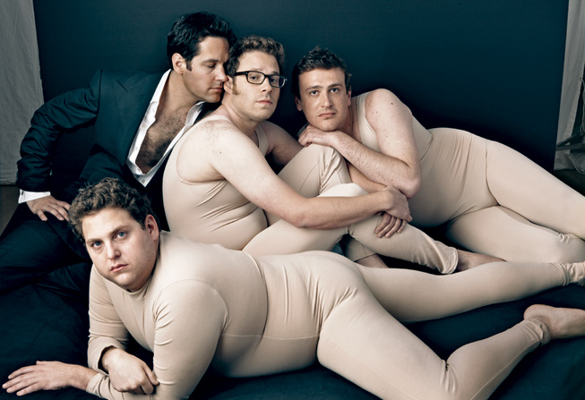
The first picture is a tongue in cheek tribute to the 2006 image, created for the April 2009 issue of Vanity Fair. Paul Rudd takes the Tom Ford position, while Seth Rogen is Keira Knightley, and Jonah Hill reclines across the front of the image, in a somewhat disturbing rendition of Scarlett Johansson's languid pose. Jason Segel has also been added.

The obvious difference between the two pictures is the level of set dressing. Whilst Leibovitz has lavished money and time on creating a sumptuous setting for the 2006 image. She has clearly to just made a cursory attempt to recreate it. The Backdrop isn't large enough to cover all the subjects and the lighting is nowhere near as pretty.

I've still got some fine tuning to do with this, and a few more things to add, but I'll post it anyway just to show I'm making an effort to catch up and not resting on my distinction laurels/distinctive laurels (I'm not sure how to describe them?) Plus it means I've posted something four days in a row!

To Be Continued...

Sunday 21 November 2010

Research: David Hockney

David Hockney, 1976, By Robert Mapplethorpe

This won't come as any surprise to those who regularly read my blog, or who know me, or just happened to have bumped in to me in the street, but I'm an idiot! Now hopefully, you're not all sitting there nodding your heads in agreement (at least not too strongly.) Because I'm exaggerating a little to make my point, never the less, I've definitely made a blunder. You see, I was under the impression that we only had to provide four pieces of research to support our work. As it turns out, it's actually ten! Having managed to retain the contents of my stomach (I could have said something else, but this isn't that kind of blog), I realised my previous lackadaisical approach wasn't going to cut it. The upside of this, is that I'll be posting things for you to read more regularly. The downside of this, is that I'll be posting things for you to read more regularly. Still, you've got to take the rough with the smooth.

As we've started the manipulation section of the course, I thought I'd post a research blog about someone who does just that. Although he only started to dabble with the production of art using digital mediums late in his career, Hockney has been experimenting  with what's considered the conventional photographic production process since the 1980's.

Born in Bradford in 1937, Hockney attended a number of art schools and colleges before he became well known as an artist. In the early 1960's he moved to Los Angeles, where his colourful paintings, combined with an ability to make seemingly simple things interesting (usually swimming pools), ensured he became inextricably linked with the now firmly established pop art scene, though Hockney himself has always denied the connection. Through the 60's and 70's, his paintings guaranteed he was a permanent fixture on the radar of most art critics, but it wasn't until the 80's that he decided to branch out and seriously try his hand at photography.

David Graves Pembroke Studios London Tuesday 27th April,
By David Hockney

Hockney has always had a somewhat unconventional approach to producing his work, so it wasn't too much of a surprise that his method of creating photographs was just as strange. Made in 1982 and measuring 513/4  inches x 261/4 inches, the above image is actually a montage of Polaroid photographs. Like a lot of developments in both art and other fields, Hockney apparently discovered this technique by accident. He needed some reference photos of a house he was painting, but didn't like the way 35mm photos taken with a wide angle lens created distortions at the edges (I assume this was barrel distortion). He decided a better method would be to take a series of Polaroid pictures and glue them together. After completing the process, he noticed that due to the slight variations in angle and location, the pictures contained a sort of narrative, they told the story of the interactions between the location, the photographer and their subject. Deciding to explore this phenomenon further, Hockney coined the term "joiners" to describe the process and the resulting photographs.

Running the risk that I might be revealing myself as a philistine who can't understand the subtleties of fine art. I think Hockney's early attempts, such as the David Graves picture, are often more about refining the process, rather than creating an  interesting picture. The subjects are usually simple set-ups, with a seated person in the centre of the picture and often just a room as the backdrop. You can already see the elements that would become a hallmark of Hockney's collages though. The odd frame is deliberately set more out of sync than it's neighbours and in some he has allowed more time to pass, therefore changing the lighting conditions. Taking all of that in to account, I actually find these early pictures a little dull (sorry!) I can appreciate the technical aspects of the pictures, and I like the idea of using Polaroids to make something greater than the constituent parts, but the subject matter doesn't inspire me. His later work on the other hand, is a whole different kettle of fish.

Place Furstenberg, Paris, August, 7,8,9, 1985, #1, By David Hockney

After perfecting the process with Polaroid pictures, Hockney moved on to using photos from a standard 35mm camera. Often taking several days, these shoots were not only technically more difficult, but frequently much grander in their scale and choice of subject. Having said that, Measuring 35 inches x 311/2 inches, the Furstenberg picture is actually smaller than the first image. Freed from the constraints of the Polaroid layout, He's now able to add some more traditional compositional ideas, such as the road leading the eye in to the distance.

Pearblossom Highway, 11th-18th April 1986 #2, By David Hockney

In many ways, this picture is the culmination of Hockney's exploration of the "joiners" concept. Measuring 78inches x 111 inches, and consisting of over 750 individual photographs. It was produced after three days of travelling, in which Hockney alternated between being the driver and the passenger. When he wasn't driving he noticed just how many more things you see compared to the driver. Split down the middle, the collage is supposed to represent this concept. As this is America and they drive on the wrong side, the right hand part of the collage, represents the drivers view. It's sparse in detail and is predominantly constructed with roadsigns. Whereas the left hand side is the passengers view. The ability to look wherever you want, means there are lots of tiny details like the litter and the extra plants. The most striking part of the picture is the sky. I don't know if it's deliberate, or not, but it reminds me of Hockney's favourite subject: swimming pools. The rich blue and the lighter edges, creates an almost prismatic texture, as if sunshine was reflecting off the water.

Apparently one of Hockney's ambitions for these pictures, was to create a modern twist on cubism. You can clearly see this in all the works, but the thing I find interesting is, although there were elements present in the Polaroid picture collages (obviously the frames create clearly delineated edges), by removing that demarcation, these later pictures are actually far more reminiscent of the cubist paintings. I know there's not a lot to really separate the two's work (or is it just me), but for some reason, they remind me more of Georges Braque's work than Picasso's. Maybe it's just because I've seen more portraits of Picasso's than landscapes, so have different mental associations.

Les Usines de Rio Tinto a l'Estaque, By Georges Braque

I don't know if it's as obvious to you reading this, as it is to me writing it, but I'm suffering from a bit of writers block. The sentences don't seem to want to flow properly today and the syntax is all over the place. I'm chalking it down to tiredness (I had a late night last night), so when I'm feeling a little more awake I'll go back and fix it.

On a better note, Marie told me on Wednesday, she thinks these ramblings are actually at distinction level, so if you'll permit me a moment...Whoop! Did I make the noise as I typed? Yes..yes I did!

Saturday 20 November 2010

Digital Manipulation: Type


As you're all smart people, I'm sure you'll have guessed from the title (that and you're all in the same class as me, so know exactly what the homework is), our next manipulation task was to include some type in a photograph. Unfortunately, I made the mistake of telling Marie that I have a bit of experience with photoshop. This does mean I feel obligated to try and do something a little more complex than just adding a new layer and plonking some writing down (damn my pride!) Well, they say pride cometh before a fall, so brace yourselves.

I've tried a few tutorials before that involve the manipulation of a typeface, but most of them involve other peoples photo's. Not being able to use those, and not having time to take similar ones myself, I've had to find one that I could modify to fit my purpose. I eventually decided to use this one: Smoke tutorial, All be it with a few steps taken out, or changed. I'm aware it doesn't look as good as the website example, but I'm still learning, so there's bound to be some rough edges.

Having picked my photo, I then opened it in photoshop:


 I knew I was going to need more space than the photo allowed, so I dragged the background layer down to the create a new layer button, which makes a duplicate layer, I then checked the show transform controls box and dragged the picture down, revealing the black of the previous layer.


Selecting the type button, I chose Reservoirgrunge as the typeface and wrote the word smoke. I then went to filter-blur-motion blur and set the angle to 90 degrees and the distance to 40 pixels. Stick with me if I get too technical, but this blurs the word.


 Open the filter menu again, and go to distort-wave. Set the generators to 3, the wavelength to 10 and 346, and the amplitude to 5 and 35. After you've done this, go to filter-blur-gaussian blur and change the pixel radius to 10. From now on I'll start to deviate from the tutorial a bit and need to make it up as I go along.


Having downloaded and installed the smoke brushes, mentioned in the tutorial, I set about trying to blend the word in to the photo. I wanted to make the smoke appear to come from the candle, so after first making sure the foreground colour was still set to white, I placed the first brush stroke in the flame itself. The writing wasn't quite in the right place, so I again used the transform tools to move it further down and to the left.


After placing as many brush strokes as I wanted, I merged the paint layer and type layer together, before clicking on the layer styles button. Selecting the outer glow option, I picked a light blue colour (#bddfe9) and lowered the opacity to 60%.


Finally I flattened the image and saved it as a jpg.

I'll leave it up to you to decide whether it works or not (just be gentle!) Personally, I don't think it came out too badly, but it could improved. If I were to do it again, I could probably spend a bit more time trying to blend the letters and the smoke together, I'd also make the shade of the smoke a little more realistic.

Just a quick edit to show you how someone can really use type to make an amazing picture: http://www.tariqdesign.com

Friday 19 November 2010

Digital Manipulation: Sepia

Cuttlefish! I know what you're thinking. He's talking about marine life in a photography blog, he's finally stepped off that precipice and in to the sweet embrace of insanity. Well you'd be wrong. I actually have a very good reason for talking about this humble little cephalopod. Anyone who's read a little about the history of photography (or watches QI), will know that the original source of sepia ink was the cuttlefish. In fact that's where the name comes from. Sepia is the name of the genus the cuttlefish belongs to. Sepia is a dark Brown ink secreted by the cuttlefish when it gets scared. The ink has been used for a number of things over the centuries, from dye to paint. Photographers quickly worked out though that it could be used to enhance the warm tones of a picture and improve the longevity of the photo, by making it more resistant to damaging elements it might be exposed to. Luckily these days there's a far easier way of getting the sepia look...photoshop!

As part of the digital manipulation section of the course Marie has asked us to create a sepia photograph using photoshop. It's actually a fairly simple process to use.

Crazy as it might sound, you can't do a lot without a photo. That then is the first step. Picking the photo you want to manipulate. Obviously you can use any photo you want, but it works best with one that could make a convincingly old picture. After flicking through my photo's I settled on this  image:

Shutter Speed 1/100, F/4.8, ISO: 100

Taken at Shugborough hall (the home of Lord Lichfield, fitting for a photography blog), It's not a great picture, the exposure of the sky is off and it's not that sharp, but I thought it would look quite good after being converted to Sepia. After opening the image in photoshop:


You then desaturate the image, by going to: image-adjustments-desaturate, which creates a monochrome picture.


You then open a new colour balance adjustment layer and increase the value of the cyan/red bar, and reduce the value of the yellow/blue bar. It's a matter of personal taste, just how much you adjust the level, but if you have another sepia photograph for comparison it makes it a lot easier. Being the shy retiring type, I prefer mine a little more on the muted side.


There you have it, ye olde sepia photograph. It doesn't look too bad, but, if we continue to mess around with it. We can improve it a bit.

To start, go to filter-noise-add noise. Then select the level of noise you want to create, I went for 6%, but it's up to you:


Opening a new layer and making sure you have the foreground and background colours set to the default black & white. Select the gradient tool and create a radial gradient covering the far corners of the picture. Switch the blending mode to multiply, and this creates a vignette. I then lowered the opacity of the gradient layer to make it a little less harsh.:


It looks a little better, but we can still improve it I think. If you go to http://www.photoradar.com they have some free resources for people to use on their photo's. One of those resources is a selection of 50 grungy frames. We'll add one of those and see how it looks. Although most of the frames are great, I decided to go with this one:


This will not only frame the picture, but also add some extra texture to the image. The problem is, that at the minute all it would do would be to cover the existing picture. Open the file and then go to image-adjustments-invert. As the name suggests, this will invert the colours in the picture:


Copy and paste the image on to the top of the existing photo, you'll need to rotate the frame by 90 degrees and adjust the size, so it fits completely over the photo. Once the frame is where you want it, switch the blending mode to multiply again.


That's a bit more interesting. Obviously this is just playing around to illustrate the principal, but if you were to take some time, add some more textures and scratches. Plus use a photo with a better overall contrast, (or adjust the levels.) I'm sure you could make a really good picture.